LOGO DESIGN - MOCKUPS - WEB LANDING PAGE
A wellness brand centred on mindfulness, strength, and balance - Avela Studios features flowing forms and grounded tones to express clarity and inner calm.
The creative direction was shaped by the idea of mindful movement - calm yet intentional, soft yet strong. The goal was to create a brand identity that visually reflects the rhythm of breath and flow, with an emphasis on balance, presence, and clarity.
The design combines clean, modern elements with a warm, organic feel, evoking the quiet strength found in stillness and the simplicity of well-being practices.
The logomark features an abstract woman in a seated yoga pose, symbolising balance and mindful presence. Paired with a softly curved logotype and clean, minimal type, the identity blends calm with quiet strength.
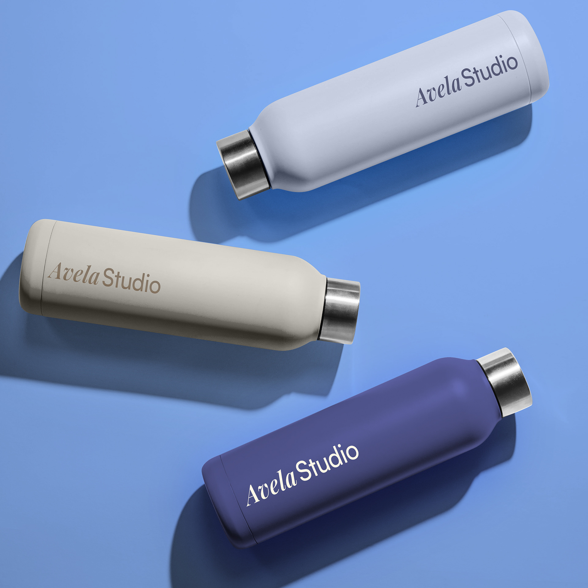
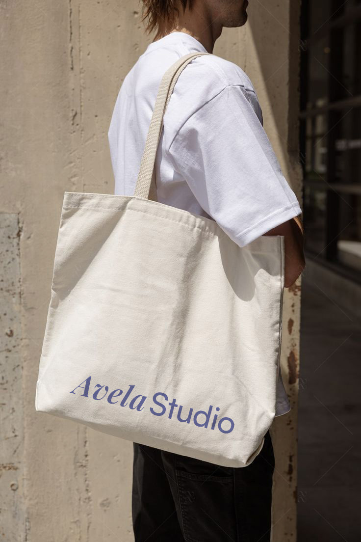
Studio tote bags and water bottles featuring the wordmark, designed with a calm and minimal aesthetic
Website landing page mockup designed to feel clean and calming, using open layout, brand aligned colours, and clear type hierarchy

